
Julia Godsif, who has a degree in sculpture from Goldsmiths University, London has launched a website dedicated to exhibiting artworks that highlight health issues surrounding air pollution.
She says on the website: ‘You are invited to submit artwork for an online exhibition on Air Pollution Art. There are plenty of topics I haven’t managed to include like air pollution from wildfires, from motor cycles, methane from cows and so on. I hope to assemble a huge collection of art which will definitely go online and hopefully find an exhibition space as well. All artwork will be vetted by a panel of three working artists.’
Julia described herself as having ‘a self-awarded season ticket for the wonderful Accident and Emergency Department. Lewisham Hospital, where she has spent many hours getting treatment for herself and for her daughter for asthma attacks.’
Shown above is the first work the visitor sees in the online gallery and is titled: The Invisible Deadly Spiderweb of Air Pollution in London. It is in acrylic on canvas and shows NO2 and PM levels based an online map of air pollution in London.
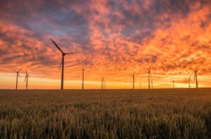
Julia provides context beneath the painting: ‘The number of petrol cars on the road is in the UK now over 40 million and they are all pumping toxic levels of pollution into the air adding to greenhouse gases and causing climate change.’
Shown left is a work titled Particulate Matter 2.5 and Particulate Matter 10
It is a self-portrait showing Julia breathing in particulate matter, using a 1963 electron micrograph of particles from London air.

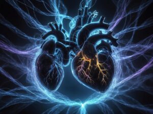
Again, she adds an explanation for her readers: ‘Particulate matter (PM) is everything in the air that is not a gas and therefore consists of a huge variety of smog particles, some of which can be toxic. Due to the small size of many of the particles called PM 2.5, they can enter the bloodstream and be transported around the body, lodging in the heart, brain and other organs. Therefore, exposure to PM can result in serious impacts to health, especially in vulnerable groups such as the young, the elderly and those with respiratory problems.
Above is The People Behind the Air Pollution Bar Chart (Acrylic on Canvas)
Each bar represents the percentage of an emission in the air, (l to R) Ammonia, Nitrous Oxides, PM 2.5,- PM10, Suphur Dioxide, Volatile Organic Compounds.
Each colour represents an emission source: Blue: Emissions from sources that use fossil fuel to make electricity, Orange: Emissions from industrial processes, Green: Emissions from vehicles, Purple: Emissions from construction and agriculture
Julia describes the image as showing ‘people playing, having fun or strolling in the park on a sunny day [who] do not realise that a cloud of air pollution is gradually descending on them from above. This is called a temperature inversion. In 2020 the Environment Protection Agency, USA, acknowledged that the highest proportion of greenhouse gases (28%) are now caused by vehicles.
Anyone who would like to submit work should contact Julia on: juliabgodsiff@gmail.com
Leave a Reply