Pretty much every country has an Air Quality Index by one name or another – Air Pollution Index, Pollution Standard Index and so on – but frustratingly there is no consistency from one to another.
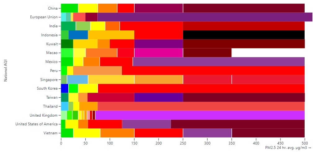
Most AQIs are graphically illustrated by a colour bar, ranging from a light green (light blue in the EU and Thailand, and dark blue in South Korea) to something appropriately alarming: dark browns, reds or the solid black that Indonesia have gone for.
The number of colours used on the bar tends to hover around the five or six, although the UK have pushed the boat out by breaking down the four main descriptors: Low, Moderate, High, Very High into a total of ten subcategories, as below.

To try and make some sense of this OpenAQ has launched the Air Quality Index Hub, to help people navigate, and make sense of, air quality indices across the world.
The chart they have created below shows how various countries’ AQIs are calibrated, based on a 24-hour average concentration for PM2.5.

China clearly have a greater tolerance for what qualifies as ‘Excellent’ air quality (green) than others on the chart. Before the country’s air has deteriorated into the cheerful yellow of ‘Good’ territory, the EU is already struggling under the ominous red of ‘Poor’.
To address this confusion, OpenAQ – a US-based environmental nonprofit with ‘a mission to provide universal access to air quality data’ – have created the AQI Hub to ‘decode the opaque nature of AQIs’ and bring all this disparate information together in one resource.
They believe that the fact many people do not know how AQIs are calculated, and that they vary widely from country to country, can lead to misunderstandings about the risks posed by air pollution.
They have designed the AQI Hub so it can be used to explore a single AQI or compare and contrast AQIs across 22 countries, from (alphabetically) Australia to Vietnam. More countries will be added in the future.
For each of these countries, the Hub provides detailed information on the background to the API, for example:
The United Kingdom’s Daily Air Quality Index (DAQI) accounts for five primary pollutants: PM2.5, PM10, O3, NO2 and SO2. The DAQI displays the air quality for the previous day. A forecast AQI also provides information on predicted pollutant levels for the next 5 days.
There is an explanation of the colour scale used by each country along with a detailed explanation of the methods used to calculate the AQI.
Explore the Air Quality Index Hub here.


Leave a Reply